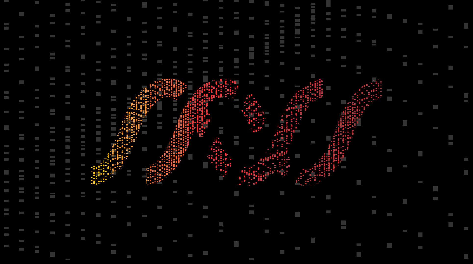
The annual end-of-year mailer is Indigo Ink’s opportunity to thank clients and reflect on the zeitgeist. For the 2018 campaign, Indigo turned inward to celebrate their newly developed in-house production techniques. Over the course of the year, they had been busy experimenting and developing a host of exclusive digital printing techniques—soft touch laminates, foil stamping, spot gloss finishing, and enhanced paper stock textures to name a few.
"Ideas Worth Printing" became a thematic approach to the campaign that celebrated the beauty of their new capabilities and the ideas that are worthy of them.
Collaboratively, we imagined a faux R&D print lab that allowed us to showcase fictional and absurd production elements—auditory swatchbooks, anti-gravity foil, bioluminescent inks, re-applicable UV coating, regenerative paper stocks. These "failed" experiments served as the humorous counterpoint to their new capabilities.
Additionally, we developed "Ideas Worth Printing" notebooks that featured their successful experiments (foil stamping, textured papers, laminate coatings) and encouraged the audience to develop their own ideas that could eventually come to fruition with Indigo Ink.
Our ultimate goal was to inspire creativity in the year ahead, experiment with new ideas, and share our mutual belief that 2018 is a time to be visionary.
Lauren’s Garden Service wanted to position itself as a brand that was literally down to earth. As a landscaping service known for hard work, natural & eco-friendly practices, and a vast knowledge of native plants, the brand wanted to appeal to clients looking for more than just a labor vendor. We positioned LGS as visionaries with design and planning capabilities… all balanced with an approachable and irreverent sense of humor.
Indigo Ink Digital Printing needed a catalog that captured the breadth of products and services that they provide. Serving as a branding piece, the “magalog” that we developed told the unique story of their craftsmanship, environmental stewardship, and tenacious pursuit of beauty through print.
Integrated branding campaign for Light Rider, an emerging technology development company focused on Quantum Lifi (unhackable data transfer via light waves). In the near future, home and office lights will invisibly modulate and securely deliver internet to your devices, essentially replacing Wifi. A suite of encryption, storage, and infrastructure products are currently in development.
Black Birch (in conjunction with a team of PR specialists, technologists, digital strategists, and web developers), created the brand on an accelerated timeline in tandem with 3D prototyping and product development.
Components:
_Logo
_Brand Guidelines
_Website
_Hubspot Landing Pages
_Social Content & Templates
_Digital Ads
_Email templates
_White Paper Templates
_Product Ecosystem Aesthetic Guidelines
_PowerPoint
_Merchandise & Accessories
_Product Development & Ideation
_Hardware UX
_Infographics
_Animation
_Packaging
_Sub-branding
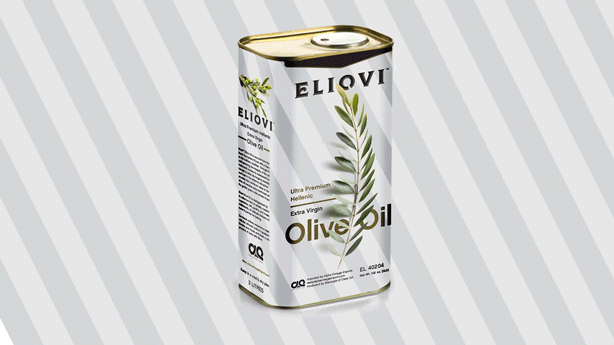
Eliovi, an emerging premium goods brand, came to us in need of packaging for their 3 litre tin of Ultra Premium Helllenic Olive Oil which is imported directly from Greece. We developed new packaging that subtly reflects key attributes of the brand itself. Bold graphic stripes mimic the Greek flag, understated minimalism alludes to the purity of the product, and the potency of the olive branch as a symbol of peace & friendship is leveraged to tell the Eliovi narrative.
Within two days of a devastating flood that destroyed most of historic Ellicott City, Maryland in 2016, Black Birch launched the Resurrect EC campaign to generate emergency funding for recovery and rebuilding of the historic town. An integrated awareness campaign (including video, print, social, and email) attracted local news coverage and raised thousands of dollars through sales of exclusively designed and branded products.
With the flood of 2018, we’ve continued to help with ongoing branding & advertising initiatives for various fundraising events throughout the region.
The Production Club of Baltimore is an educational and networking association serving graphic designers and marketing professionals. In addition to branding, design, and copywriting, Black Birch is heavily involved in content development including curating guest lectures, exclusive film screenings, and event planning.
Semper Sec, a cyber security enterprise for growing businesses, needed to reposition as a sophisticated, corporate-focused brand with renewed clarity of purpose. Drawing upon the principal’s U.S. Marine Corps history, our team developed an identity that reinforced the brand promise of military-grade cyber security at the growing enterprise level. Along with a monogram double “S,” the mark contains iconography that alludes to the brand’s backstory—the mameluke sword blades of the U.S. Marine Corps, chevron insignia, and stylized infinity loop hinting at the translation of “semper sec” (always secure). Bold typography featuring a hidden “slice” of negative space in the “R” bridges the logotype with the icon and sets up the “slash” motif extended throughout collateral.
We developed a holistic brand approach for the Colorado-based startup, Hydrologie Wellness.
Not only concerned with market presence, the IV infusion company sought to educate prospects on the benefits of medically-trained, practitioner-grade therapies (over more retail-based "salon" experiences). Extensive preliminary research exposed oversaturation of the company's initial name, leading Black Birch to develop a thorough list of alternate monikers. Ultimately landing on "Hydrologie," a brand narrative followed which focused on "Pure Elevation": a clinical, science-based approach to elevating mind, body, and beauty (at the foot of the Rockies).
Brand deliverables include:
- Naming, logo suite, and brand guidelines
- Print collateral
- Digital assets
- Environmental graphics, signage, banners
- Storefront/clinical space renderings
- Apparel
- Icon Library
- Art direction & custom photo library